UX Case Study
Mobile App Design for Platform Coffee Bar
Project Overview
Platform Coffee Bar is an independent coffee bar that offers coffee beverages and roasted coffee beans from around the world in Markham, Ontario.
To enhance customer convenience, the Platform Coffee Bar has introduced a mobile app that enables patrons to conveniently place their coffee orders in advance, eliminating the need to wait in line and ensuring prompt and efficient service.
My Role
Product Designer
Project
Personal Project
Timeline
October 2021 to January 2022
Tools Used
Figma, Google Slides
The Problems
Due to its limited seating capacity, the coffee shop often experiences a considerable wait time for customers to receive their orders.
This has led to an inconvenience for patrons who wish to promptly enjoy their beverages.
Additionally, the current absence of a dedicated customer engagement and loyalty program means that the coffee shop is unable to effectively reward its loyal customers or share exclusive promotions beyond social media channels.
The Goals
The goal is to introduce the Platform Coffee Bar mobile app - your ultimate solution for a seamless coffee ordering and pickup experience.
Designed with our valued customers in mind, this app aims to closely replicate the in-store experience, ensuring convenience and satisfaction at every step.
Understand the Users
Through comprehensive interviews and empathy mapping, I gained valuable insights into the users I'm designing for and their unique needs.
One prominent user group that emerged from my research is working adults who rely on a cup of coffee to kickstart their day or rejuvenate during breaks.
User Research: Pain Points
1. Time
During peak working hours, the process of ordering and picking up drinks in stores can be excessively time-consuming for users.
2. Information Architecture
Users often encounter difficulties when navigating and reading menus in apps that contain extensive amounts of text.
3. Discount and Promotion
Customers express the desire to stay informed about store promotions and frequently complain about the absence of a loyalty program that would allow them to earn rewards and enjoy benefits such as discounts for making multiple purchases.
4. Food Ingredients:
Users often experience uncertainty about the suitability of drinks due to a lack of knowledge regarding the food ingredients before placing an order.
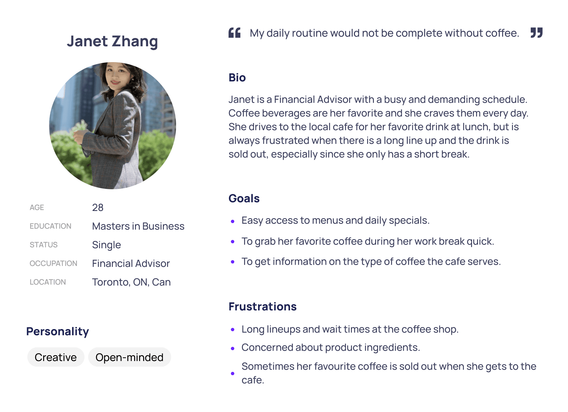
User Persona: Janet Zhang
The user persona - Janet Zhang is a fictional character crafted from the data gathered during the research phase, serving as a representative figure whose goals and characteristics embody the broader needs and traits of a specific user group.
User Persona: Janet Zhang
The user persona - Janet Zhang is a fictional character crafted from the data gathered during the research phase, serving as a representative figure whose goals and characteristics embody the broader needs and traits of a specific user group.
User Persona: Janet Zhang
The user persona - Janet Zhang is a fictional character crafted from the data gathered during the research phase, serving as a representative figure whose goals and characteristics embody the broader needs and traits of a specific user group.
User Journey
Analyzing Janet's user journey shed light on the significant benefits of having a dedicated mobile ordering app for Platform Coffee Bar, highlighting its potential to greatly enhance the overall user experience and convenience for customers.
User Journey
Analyzing Janet's user journey shed light on the significant benefits of having a dedicated mobile ordering app for Platform Coffee Bar, highlighting its potential to greatly enhance the overall user experience and convenience for customers.
User Journey
Analyzing Janet's user journey shed light on the significant benefits of having a dedicated mobile ordering app for Platform Coffee Bar, highlighting its potential to greatly enhance the overall user experience and convenience for customers.
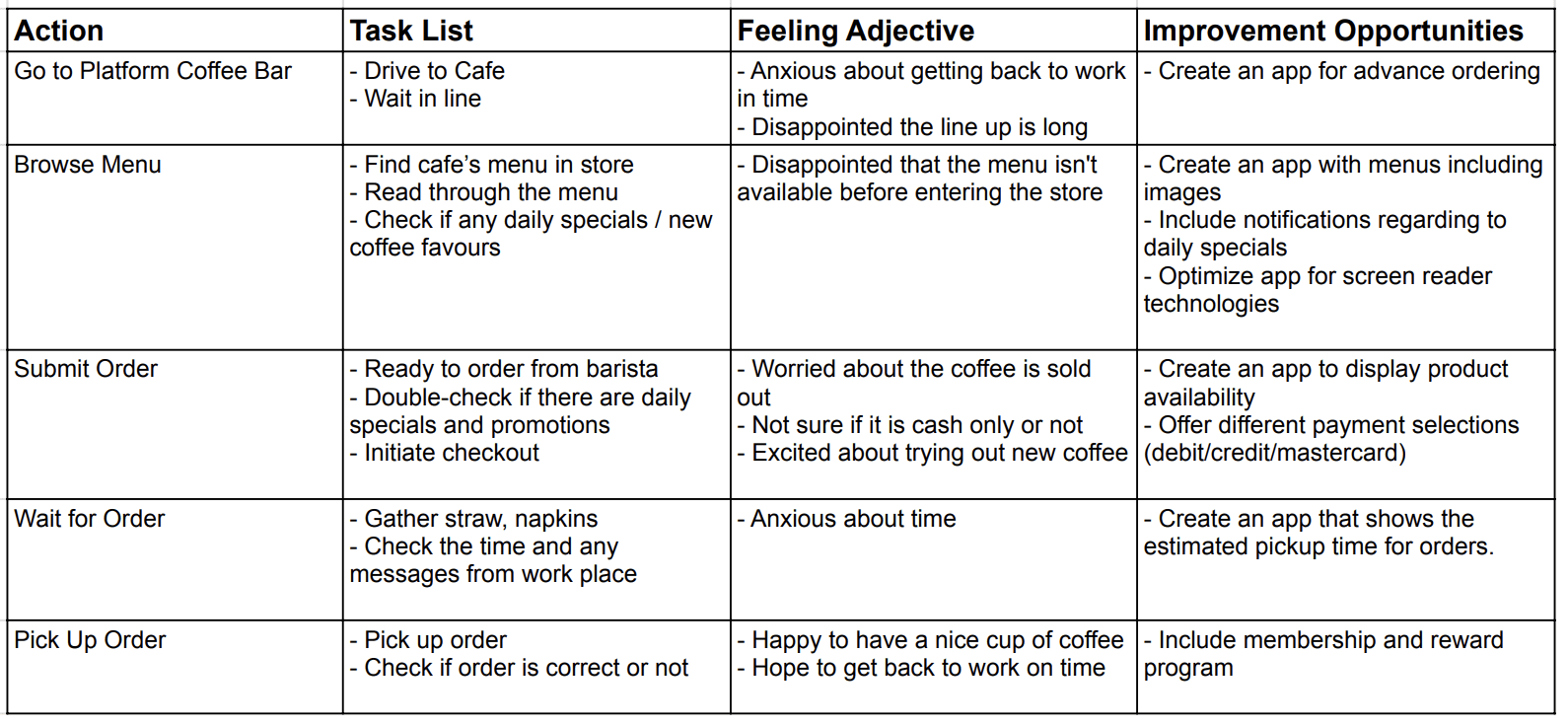
Janet’s frustration
The user journey demonstrates Janet's frustration with the extended wait times for ordering and picking up her coffee.
The user journey also reveals that Janet experiences stress and concern about being late for work due to the prolonged waiting times for her coffee order.
Janet’s frustration
The user journey demonstrates Janet's frustration with the extended wait times for ordering and picking up her coffee.
The user journey also reveals that Janet experiences stress and concern about being late for work due to the prolonged waiting times for her coffee order.
Janet’s frustration
The user journey demonstrates Janet's frustration with the extended wait times for ordering and picking up her coffee.
The user journey also reveals that Janet experiences stress and concern about being late for work due to the prolonged waiting times for her coffee order.
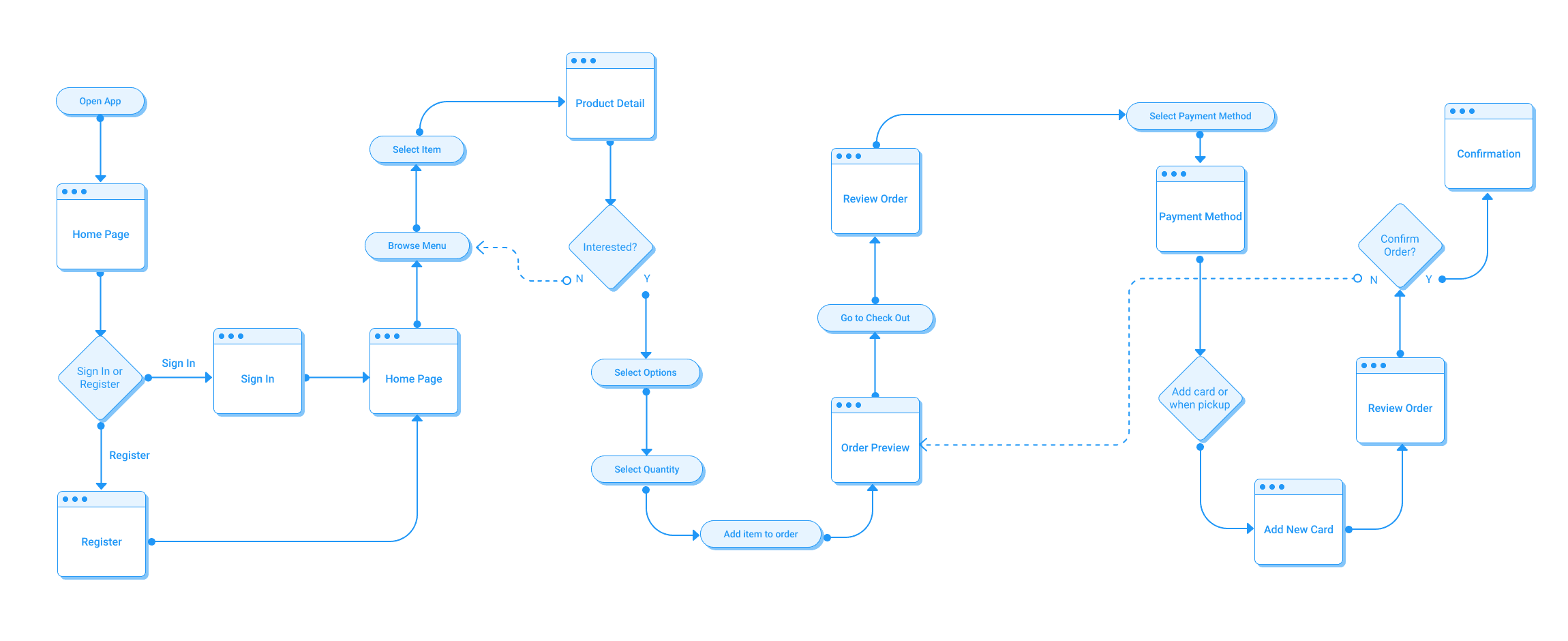
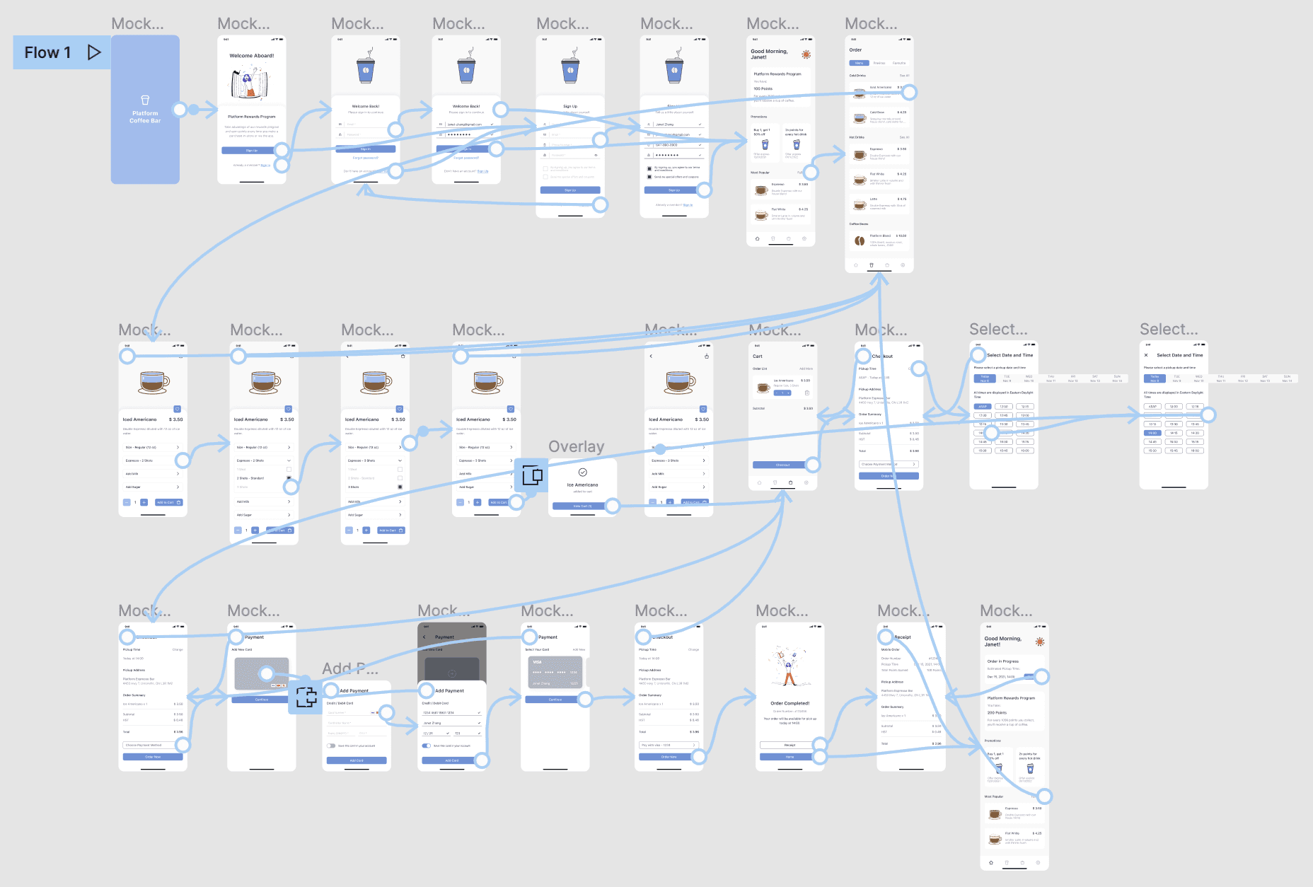
User Flow
The next step in the design process was to create a user flow chart for the mobile ordering app for Platform Coffee Bar.
The user flow chart consists of a start point and an end point where the users reach their goals.
In this case, Janet's start point is to open the application, and her end point is to receive the coffee she requested.
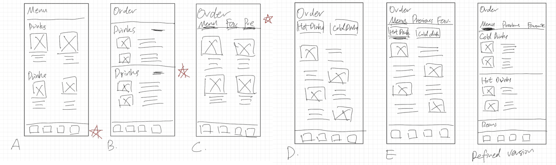
Design Phase - Paper Wireframes
I started with wireframes, mockups, and high-fidelity prototypes.
Taking the time to draft iterations for each screen of the app on paper ensured that the elements that made it to digital wireframes would be well-suited to address user pain points.
For example, in the menu page, I created a scrollable menus with images for better accessibility.
*Stars were used to mark the elements of each sketch that would be used in the initial digital wireframes.
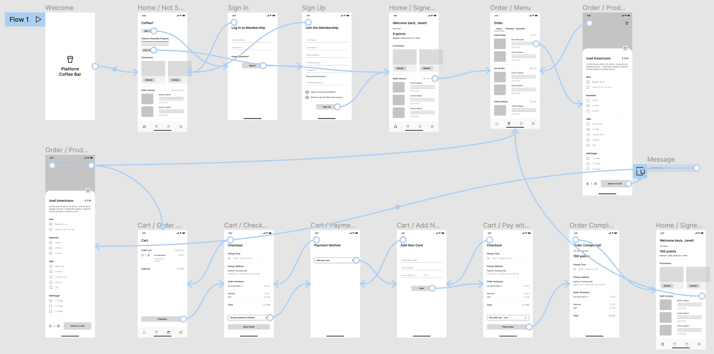
Low-fidelity Prototype
As the initial design phase continued, I made sure to base screen designs on feedback and findings from the user research.
Using the completed set of digital wireframes, I created a low-fidelity prototype.
The primary user flow I connected was customizing and ordering a coffee, so the prototype could be used in a usability study.
Usability Study Findings: Low-fidelity Prototype
Usability Study Findings: Low-fidelity Prototype
Usability Study Findings: Low-fidelity Prototype
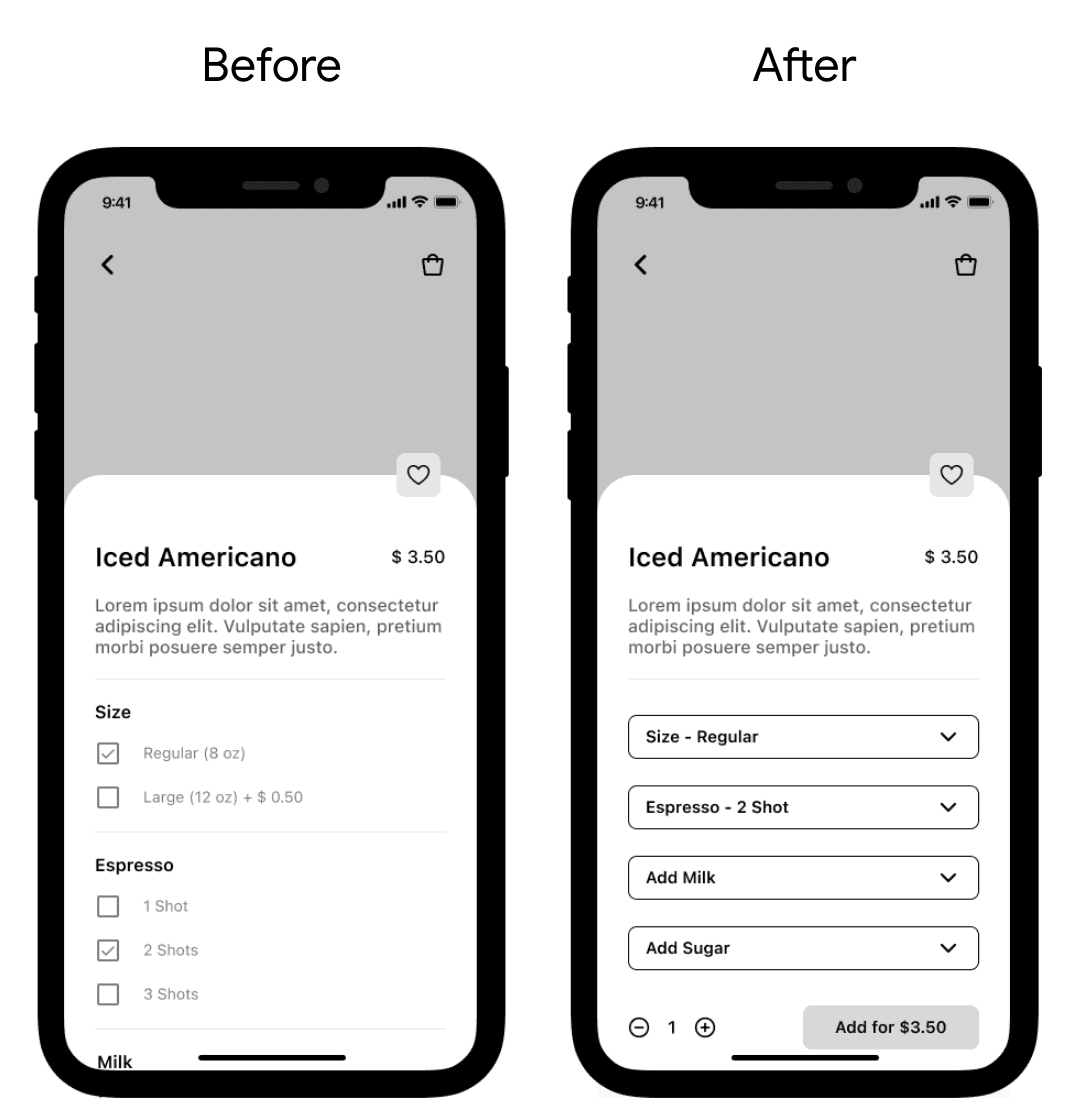
1. Users need a faster and easier way to customize the drinks using the original recipe as a guide.
Supporting evidence from the usability study:
3 out of 5 participants felt that the customization options were too long to read and that the original recipe was not shown next to each category of the drink details.
Changes I made as a result of the usability study:
Organize the customization opinions in dropdown menus with the original recipe listed next to each category so users can customize their drinks quickly.
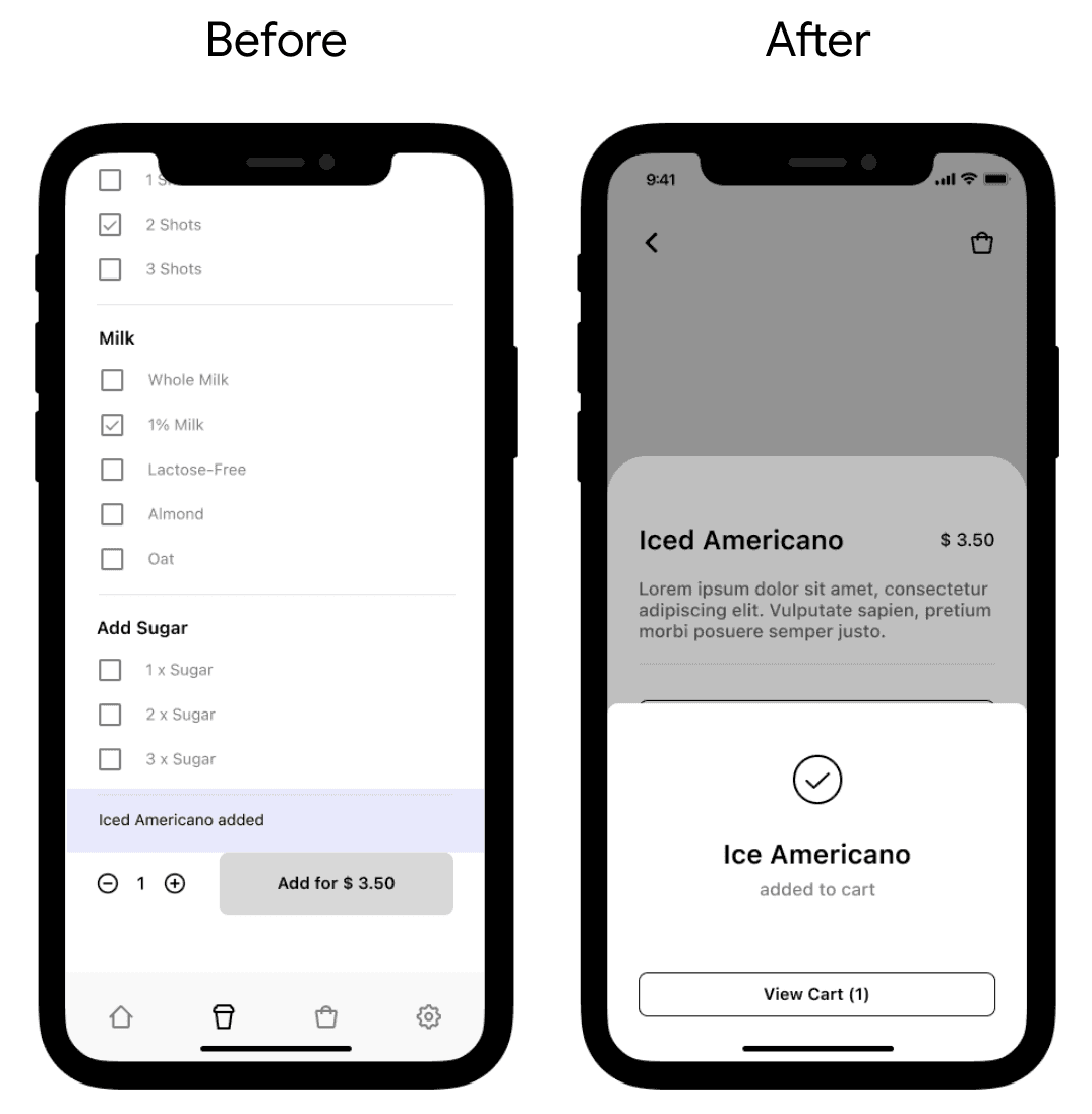
2. Better instructions needed regarding how to navigate to the cart page and proceed through the checkout process.
Supporting evidence from the usability study:
4 out of 5 participants had difficulty identifying what button they needed to press to start the checkout process after adding drinks to their cart.
Changes I made as a result of the usability study:
A pop-up window with a button to the cart will be displayed when users press the add to cart button to give them a better indication of how to get to the cart and checkout.
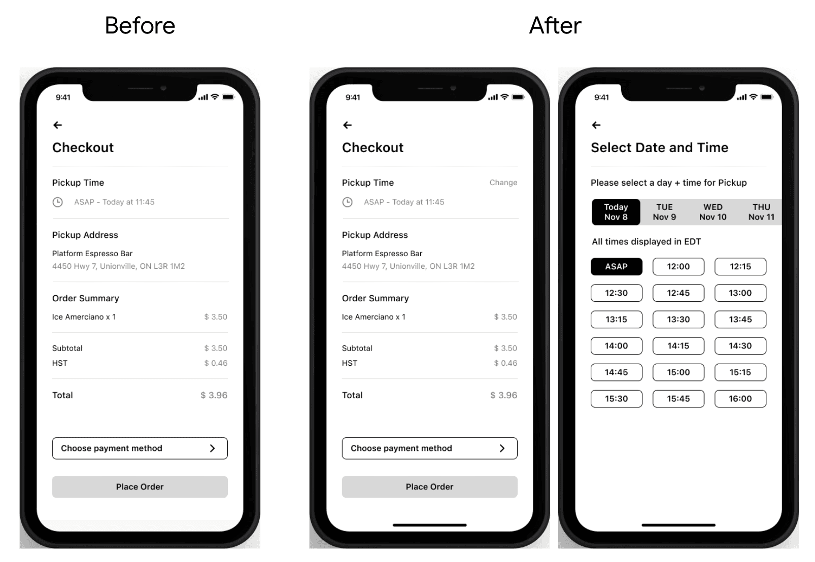
3. Users need the option to select the pick up time according to their own schedules.
Supporting evidence from the usability study:
3 out of 5 participants noticed the estimated pickup time on the checkout page and wanted to select a different time.
Changes I made as a result of the usability study:
Add a pickup time option to the checkout process so users can order in advance and choose a pickup time that works best for their schedule.
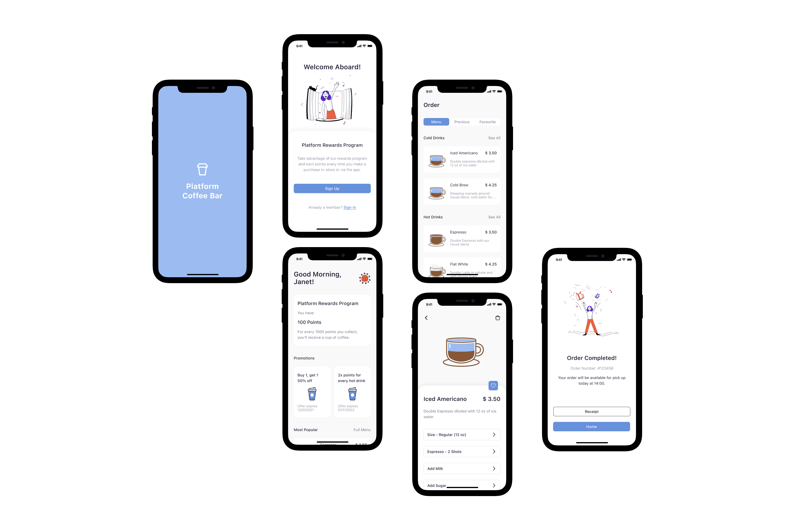
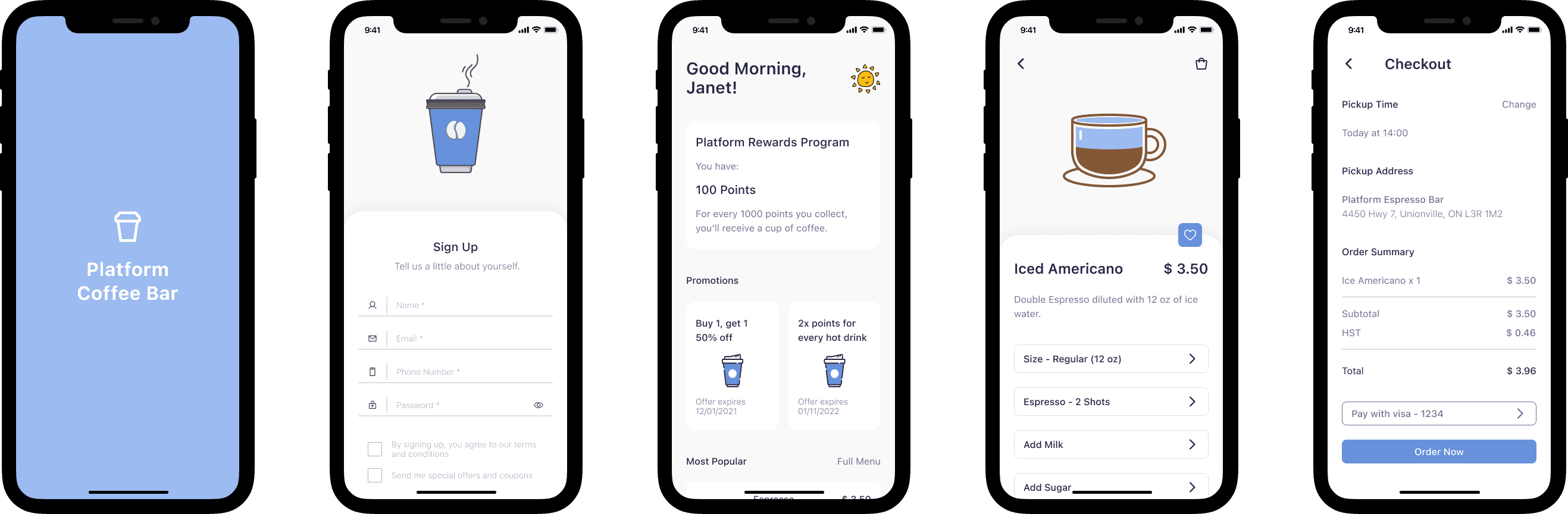
Mockups
After testing the low-fidelity prototype and making modifications based on the feedback, I created mockups with visual designs that align with Platform Coffee Bar's branding.
Mockups
After testing the low-fidelity prototype and making modifications based on the feedback, I created mockups with visual designs that align with Platform Coffee Bar's branding.
Mockups
After testing the low-fidelity prototype and making modifications based on the feedback, I created mockups with visual designs that align with Platform Coffee Bar's branding.
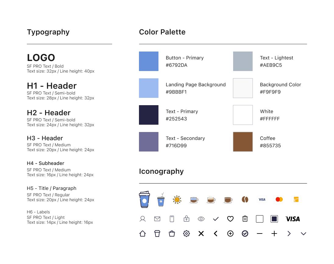
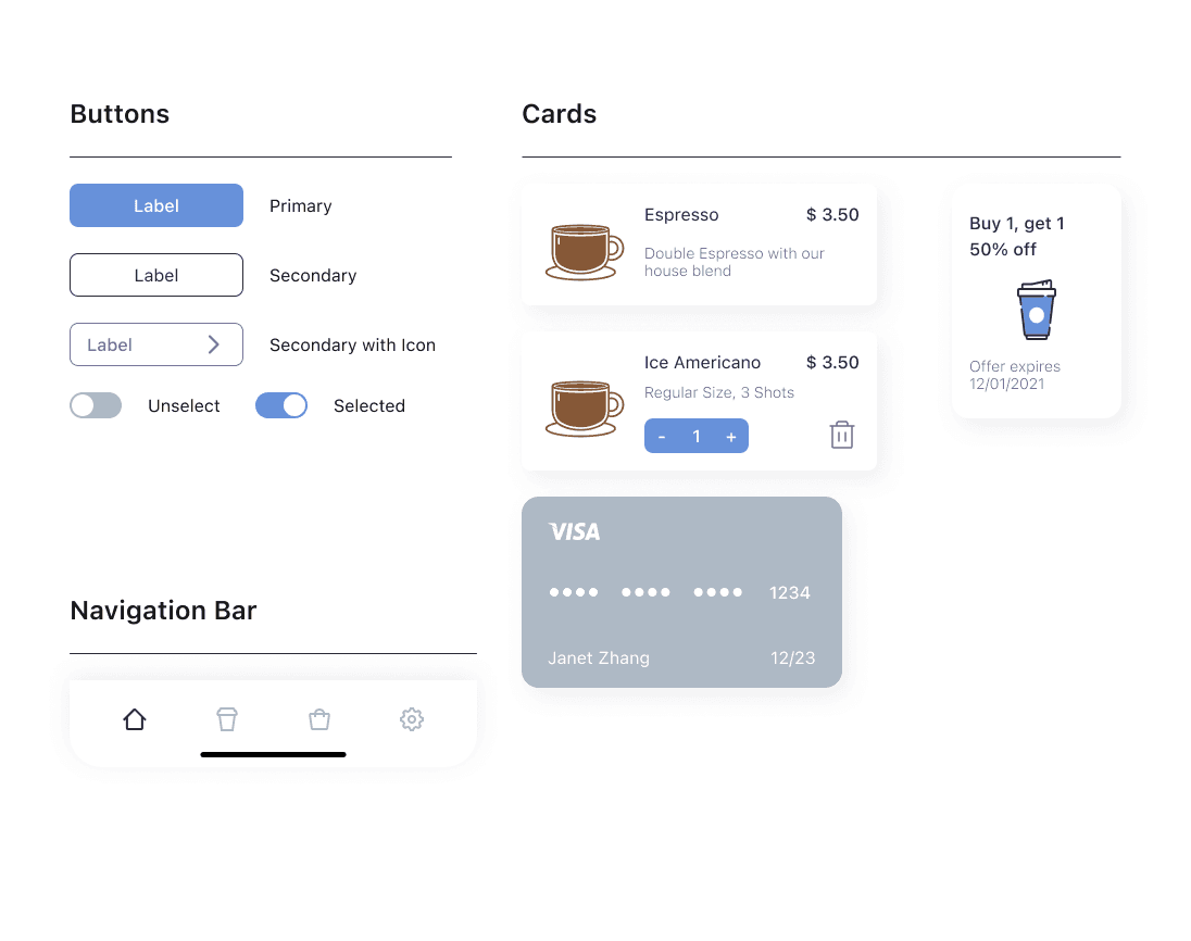
Design System
Design System
Design System
Usability Study Findings: High-fidelity Prototype
Usability Study Findings: High-fidelity Prototype
Usability Study Findings: High-fidelity Prototype
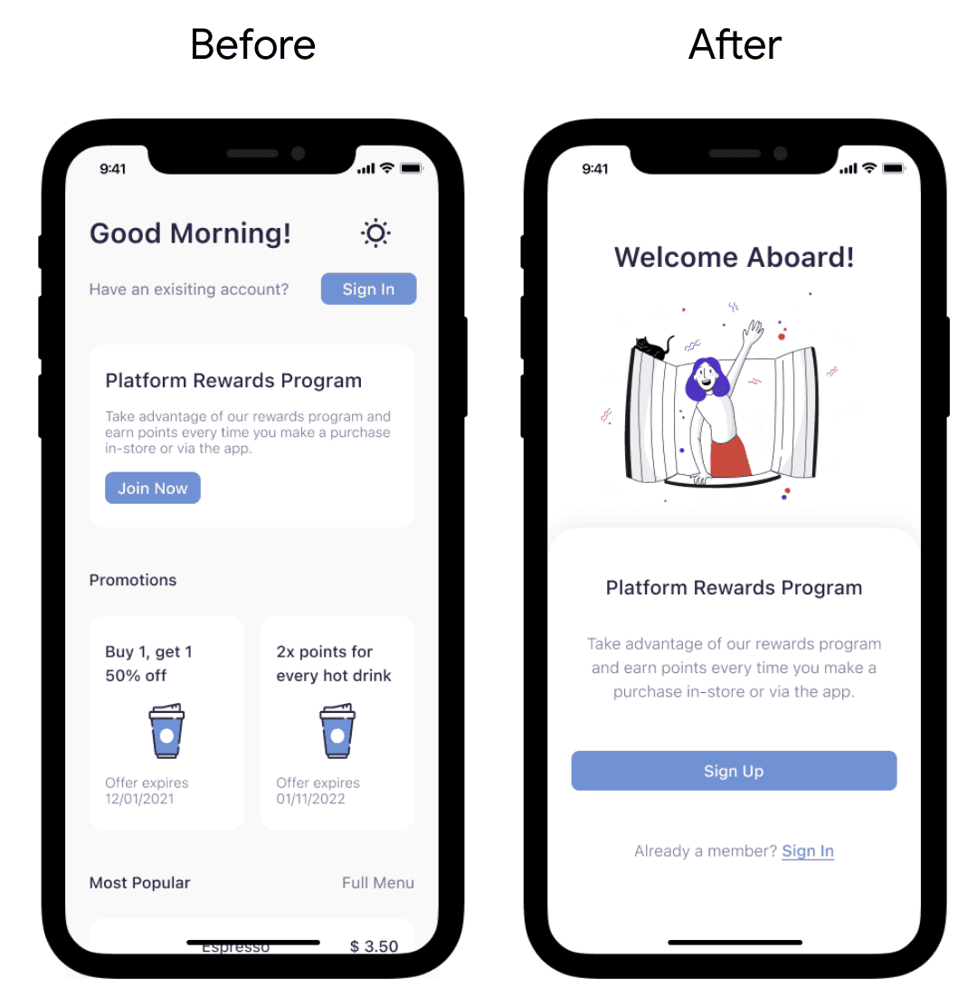
1. Users need better cues for what steps are required to register an account.
Supporting evidence from the usability study:
3 out of 5 participants had difficulty distinguishing between the words "Sign in" and "Join now" on the buttons under the homepage and were unsure which button to click upon registering.
Changes I made as a result of the usability study:
I created a landing page explaining the rewards program before directing users to the home page, showing them where to sign up and sign in.
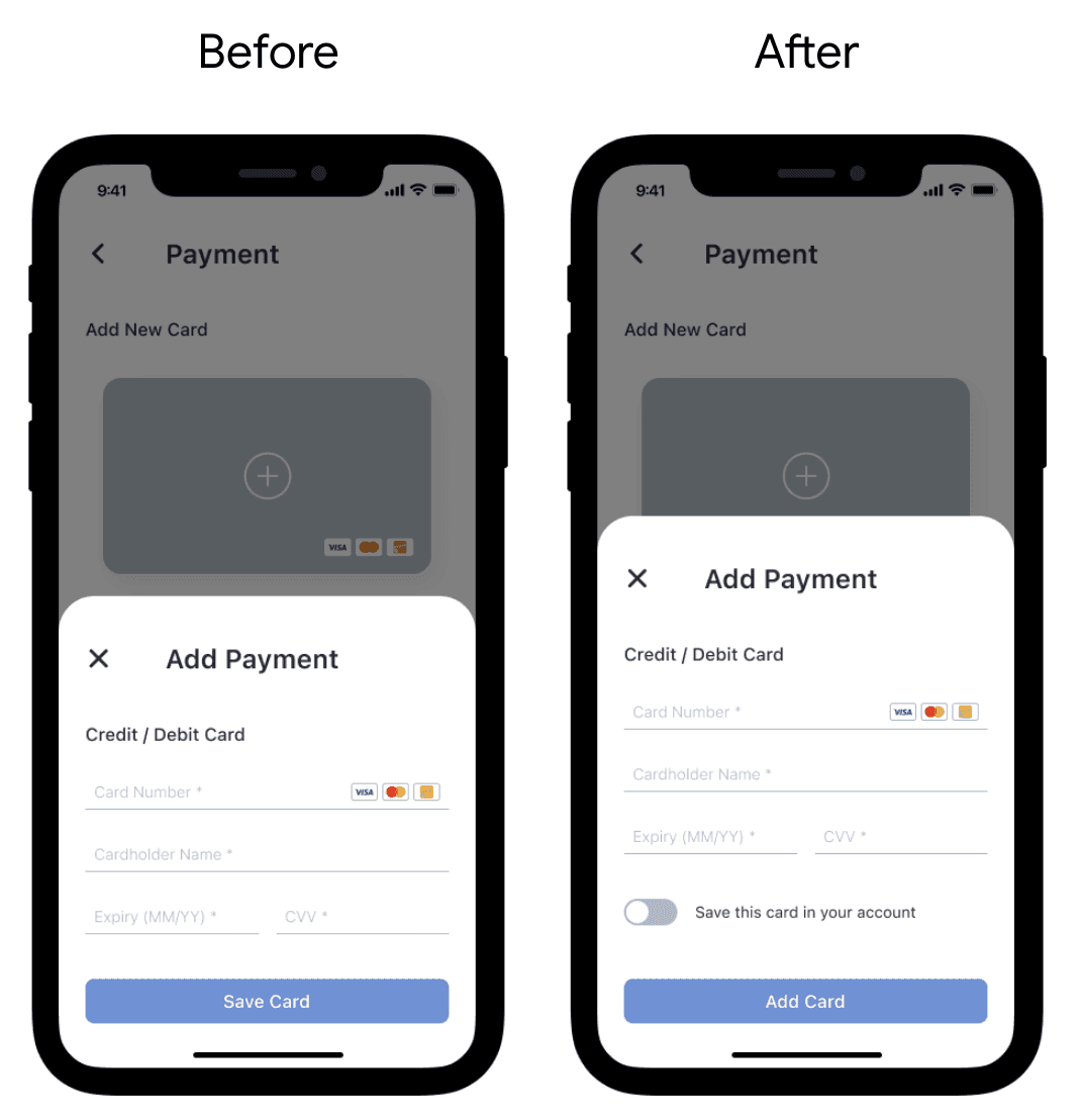
2. Most users need the option to save or unsave their payment methods for future use.
Supporting evidence from the usability study:
“It will be nice to be able to choose whether or not to save the credit cards as default payments.” — Van Z, coffee consumer from Markham, Ontario
Changes I made as a result of the usability study:
In the add payment section, I added a toggle switch that allows users to choose whether or not to save their cards as payment methods.
Accessibility considerations
Implemented icons to enhance navigation convenience.
Employed intricate imagery of coffee varieties to enhance user comprehension of the designs.
Accessibility considerations
Implemented icons to enhance navigation convenience.
Employed intricate imagery of coffee varieties to enhance user comprehension of the designs.
Accessibility considerations
Implemented icons to enhance navigation convenience.
Employed intricate imagery of coffee varieties to enhance user comprehension of the designs.
High-fidelity Prototype
High-fidelity Prototype
High-fidelity Prototype
Takeaways: Impact
Upon presenting the high-fidelity prototype to the study participants, I received overwhelmingly positive feedback.
The app left users with a profound impression that Platform Coffee Bar genuinely prioritizes meeting their needs.
Takeaways: Impact
Upon presenting the high-fidelity prototype to the study participants, I received overwhelmingly positive feedback.
The app left users with a profound impression that Platform Coffee Bar genuinely prioritizes meeting their needs.
Takeaways: Impact
Upon presenting the high-fidelity prototype to the study participants, I received overwhelmingly positive feedback.
The app left users with a profound impression that Platform Coffee Bar genuinely prioritizes meeting their needs.
Next Step
Conduct another round of usability studies to validate whether the pain points users experienced have been effectively addressed.
Conduct more user research to determine any new areas of need.
Next Step
Conduct another round of usability studies to validate whether the pain points users experienced have been effectively addressed.
Conduct more user research to determine any new areas of need.
Next Step
Conduct another round of usability studies to validate whether the pain points users experienced have been effectively addressed.
Conduct more user research to determine any new areas of need.