UX Case Study
IEMHP Membership Landing Page Redisgn
My Role
UX Designer
Team Size
2 People
Timeline
3 Weeks - Nov 2022 to Dec 2022
My Role
User Research, Comparitive Analysis, User Experience, User Interface Design
Sprint 01 - Week 01
Sprint 1 involved conducting thorough user research, gathering valuable insights to inform the subsequent design process.
To initiate the redesign of the membership page, our team engaged in a comprehensive discussion to gain a thorough understanding of the organization's requirements, gather existing stakeholder knowledge, align expectations, and establish consensus on the project's plans, priorities, direction, and key milestones.
Questions We Ask Include:
How familiar are you with Infant and Early Mental Health Promotion (IEMHP)?
What factors would motivate you to become a member of IEMHP?
What challenges or barriers, if any, have prevented you from becoming a member of IEMHP?
How would you rate the current IEMHP website in terms of its design and user-friendliness?
What improvements would you like to see in the design and functionality of the IEMHP website's membership page?
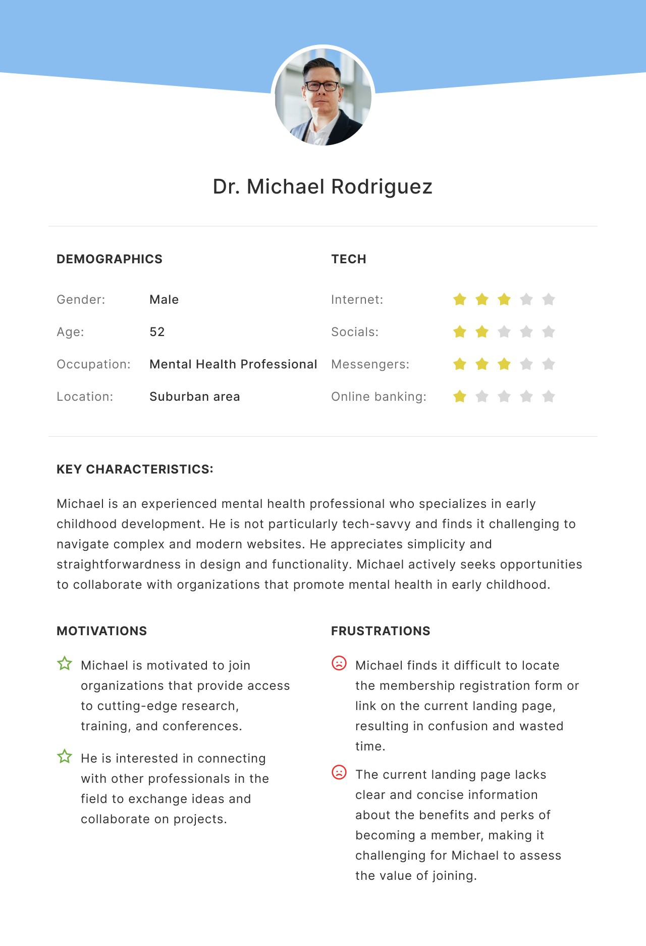
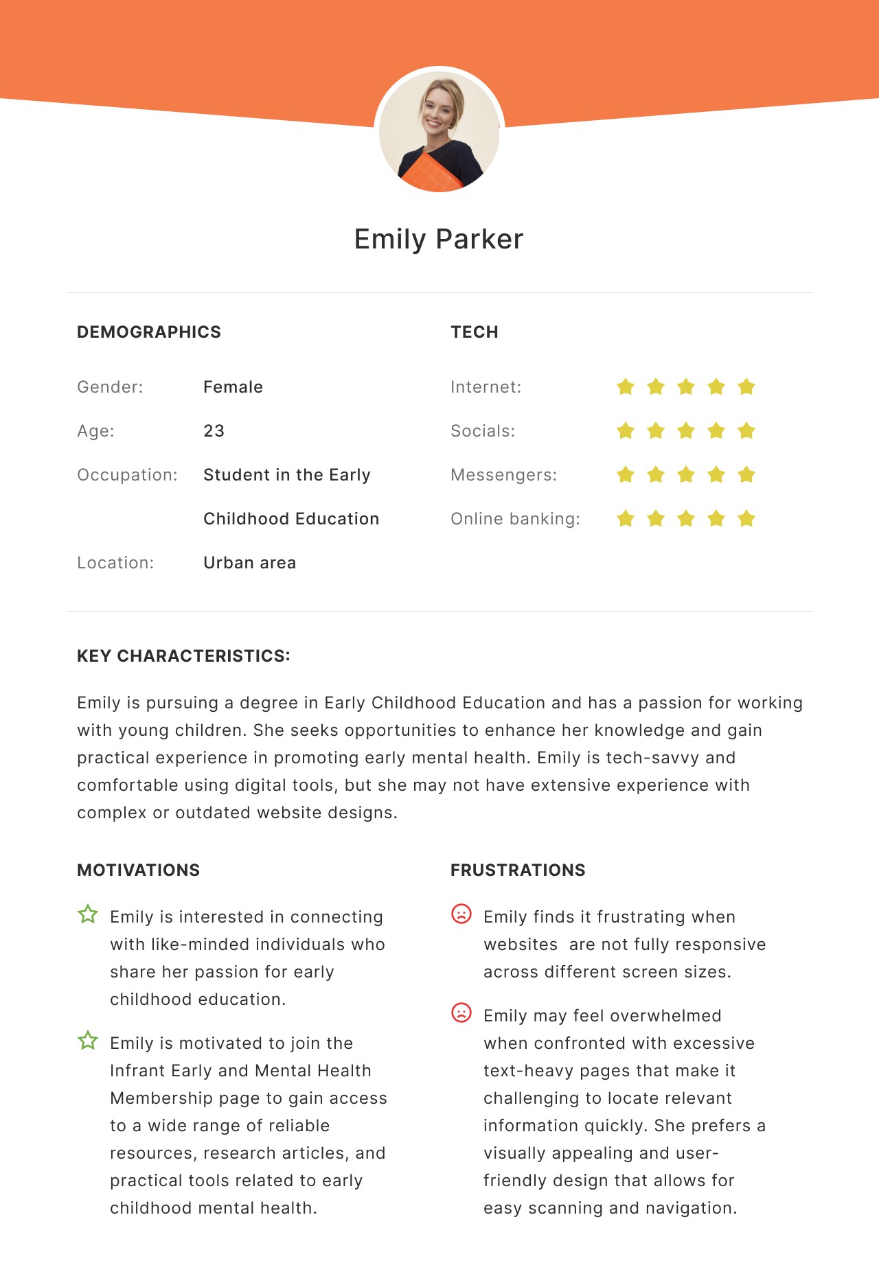
1. Lack of Awareness
7 out of 10 users were not familiar with IEMHP and its membership program, leading to a lower conversion rate.
2. Unclear Value Proposition
8 out of 10 users did not fully understand the benefits and value of becoming a member, which reduced their motivation to sign up.
3. Inadequate Visual Hierarchy
10 out of 10 users find it difficult to locate essential information and navigate through the page.
4. Inadequate Mobile Experience
10 out of 10 users have reported that the current design does not effectively adjust to different screen sizes, including mobile and tablet devices. As a consequence, they encounter challenges such as encountering small text, overlapping elements, and distorted visuals.
A prominent design pattern we observed across these websites was the placement of the "Join" or "Become a Member" button as the primary call to action.
This design choice effectively emphasizes the importance of membership and facilitates user engagement.
By strategically placing the membership button in a prominent location, such as the header, sidebar, or a dedicated membership section, non-profit organizations prioritize user involvement and streamline the process of joining.
This design pattern aims to make it easier and more efficient for users to become members, ensuring a seamless and user-friendly experience that encourages active participation in the organization's initiatives.
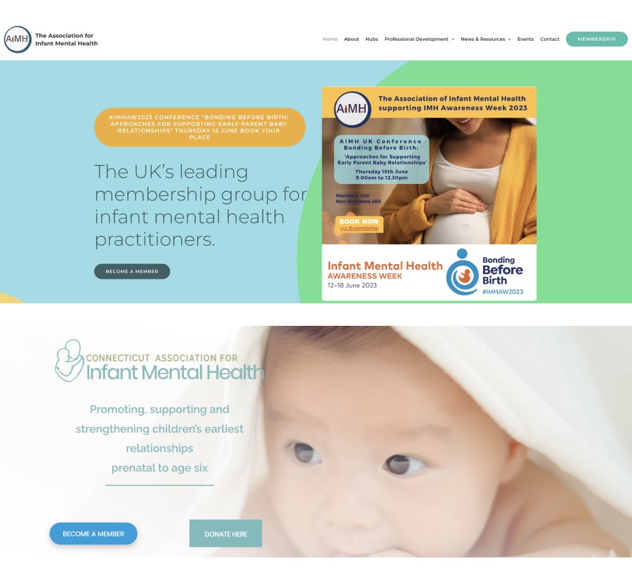
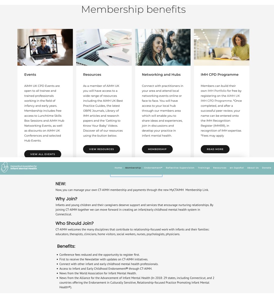
During our analysis of non-profit websites, we observed a recurring design pattern where each organization prominently displayed a list of benefits for becoming a member.
This approach played a crucial role in effectively communicating the mission of each non-profit to users and helping them gain a better understanding of the organization's purpose and activities.
By highlighting the specific advantages and privileges that come with membership, these non-profits were able to engage users and convey the value of supporting their cause.
This practice proved instrumental in informing users about the benefits they would receive by joining and contributed to a better overall user experience.
Sprint 02 - Week 02
During Sprint 2, I smoothly progressed from analyzing research findings to creating wireframe designs, ensuring they aligned with user-centered design principles.
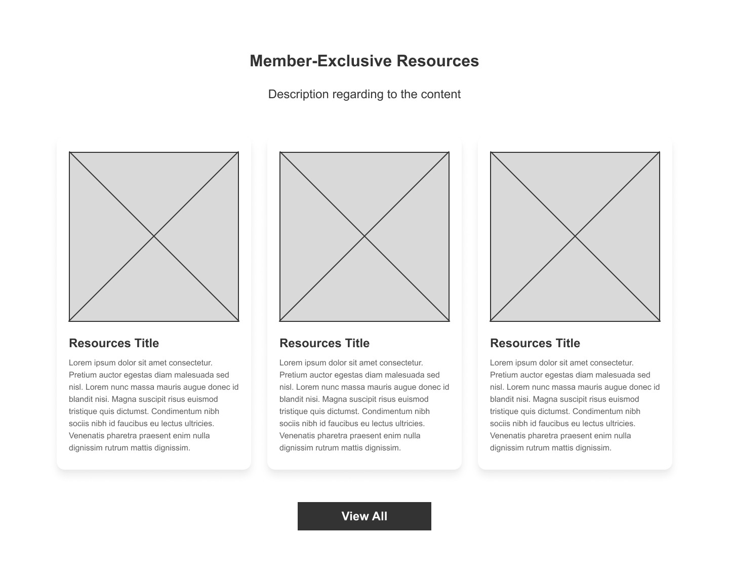
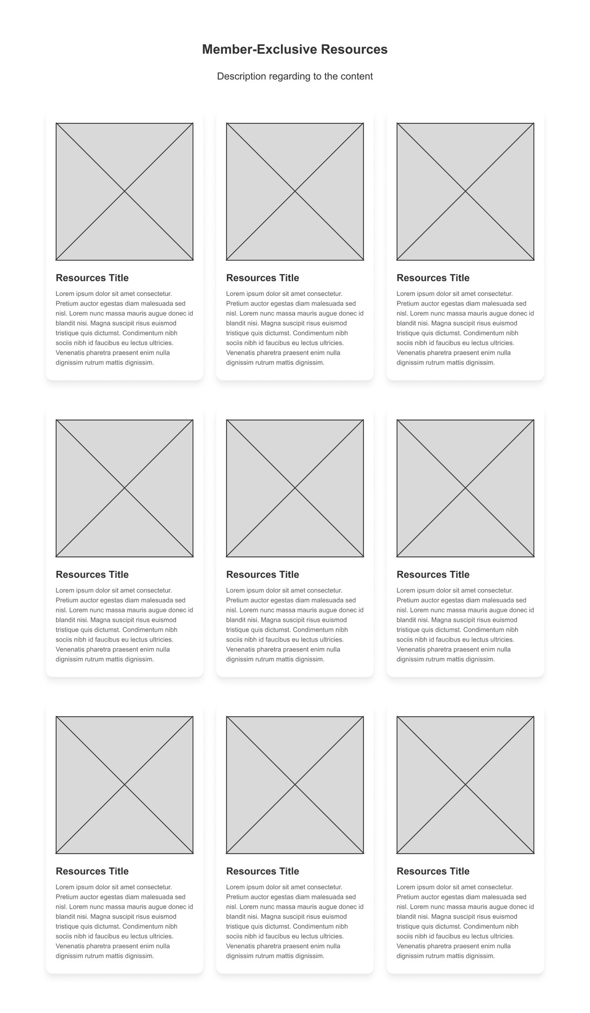
However, 4 out of 5 expressed concern about not being able to view the complete list of excessive membership-exclusive content in one section. They find it inconvenient to have to click "View All" to access more membership-exclusive content, considering it an extra step that lacks efficiency.
Taking this valuable feedback into consideration, I made the following changes:
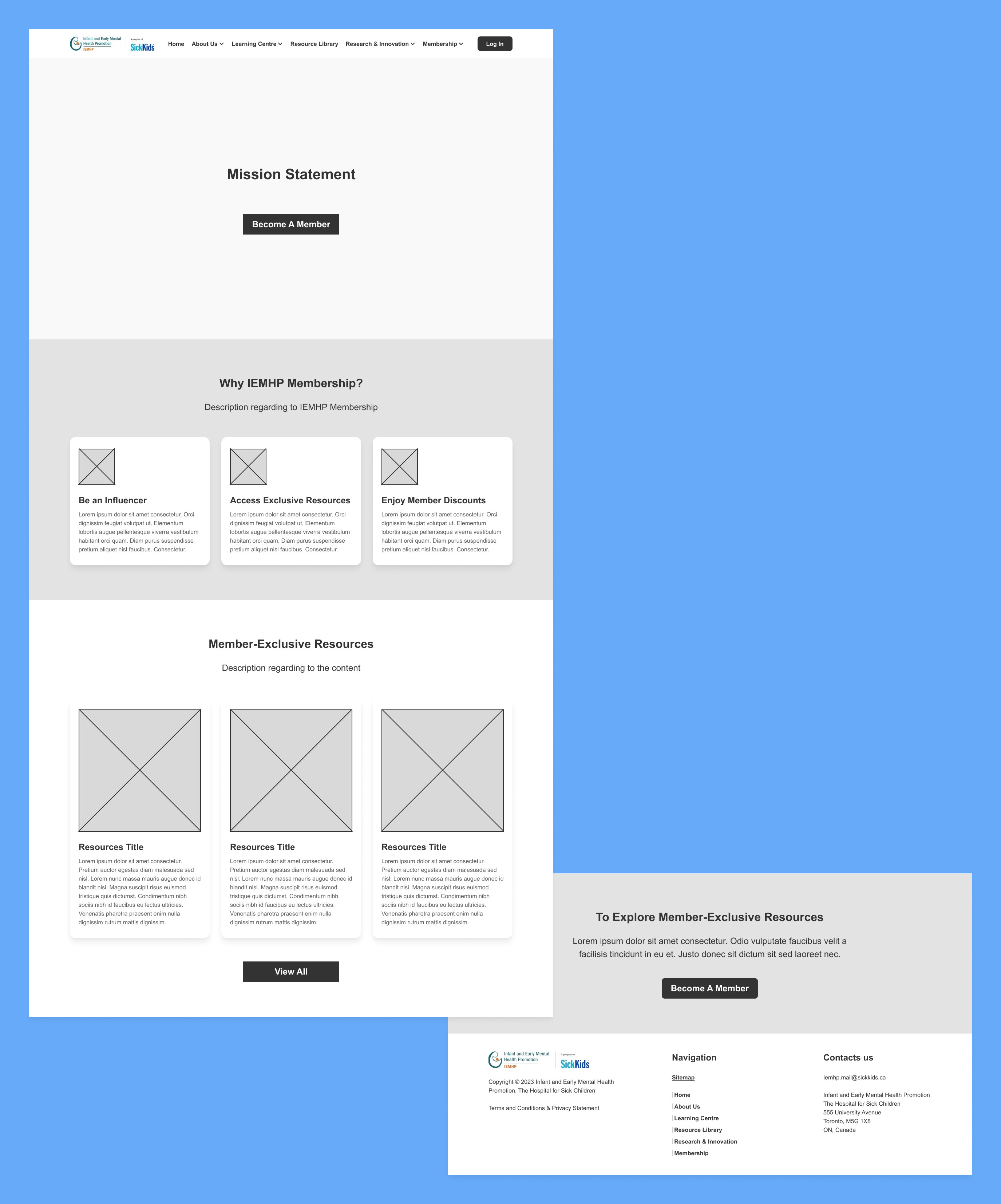
Rather than displaying just some of membership-exclusive contents with a "View All" button, I have opted to list all the membership-exclusive contents directly on the membership landing page. This allows users to see and access all the contents without the need to navigate to another page.
Before Usability Study
After Usability Study

Once the functionality of our design was solidified, we proceeded to the next stage: designing the user interface (UI).
Sprint 03 - Week 03
In Sprint 3, I transformed the wireframes into high-fidelity mockups, delivering a polished and user-centric visual experience.
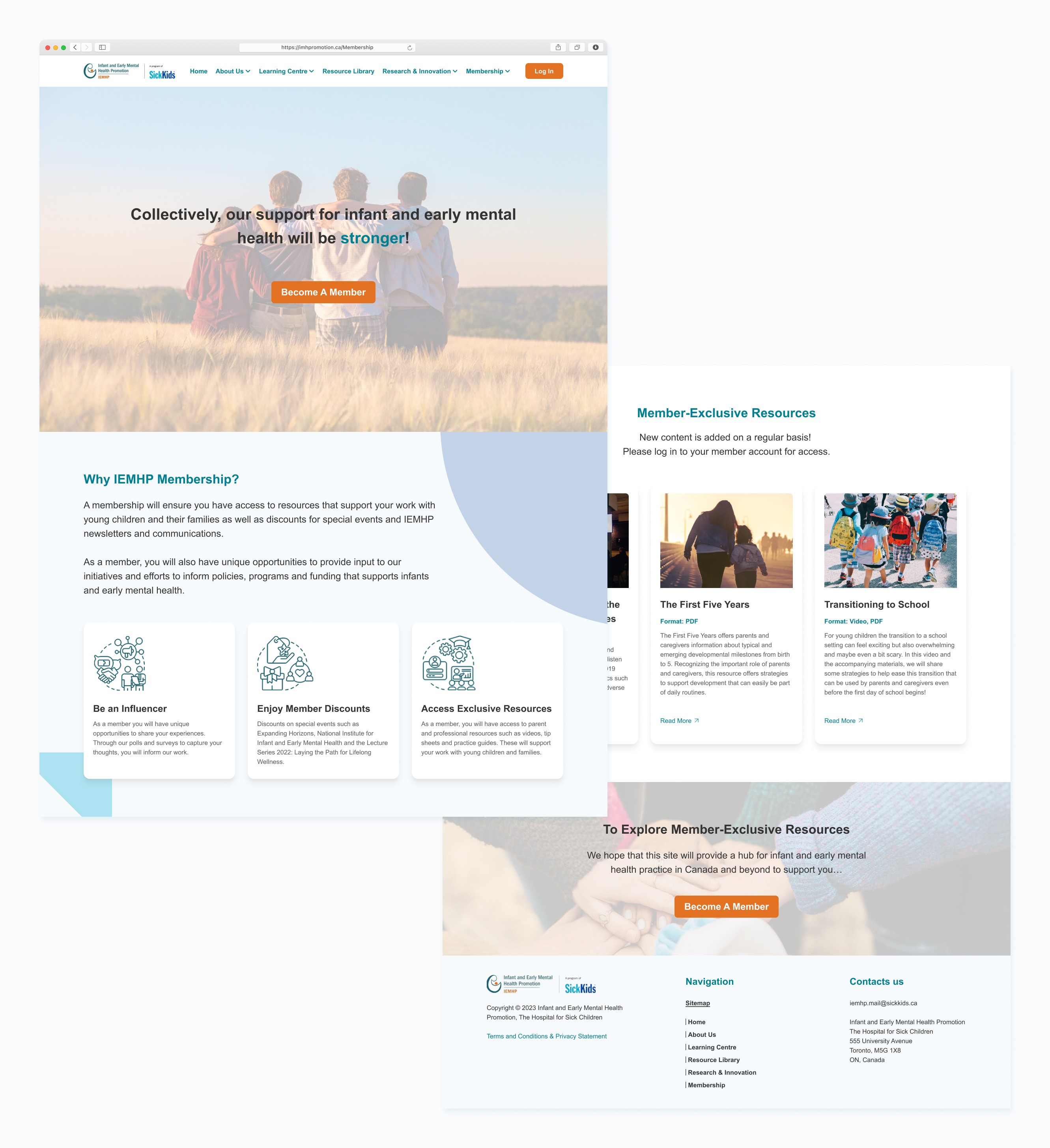
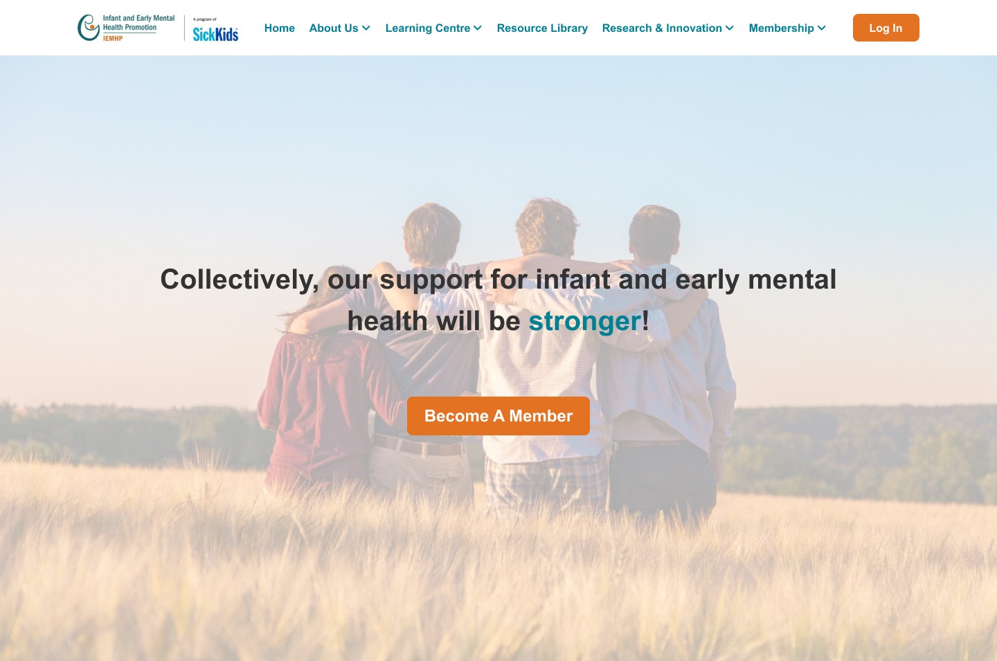
Simplify the layout: To enhance the user experience, I have implemented a redesigned membership page with a clean and organized layout. The information is now presented in a more user-friendly manner, utilizing headings, subheadings, and bullet points to break down the content into easily scannable sections. By avoiding excessive text and dense content, we aim to prevent overwhelming users and ensure that the information is easily digestible and accessible.
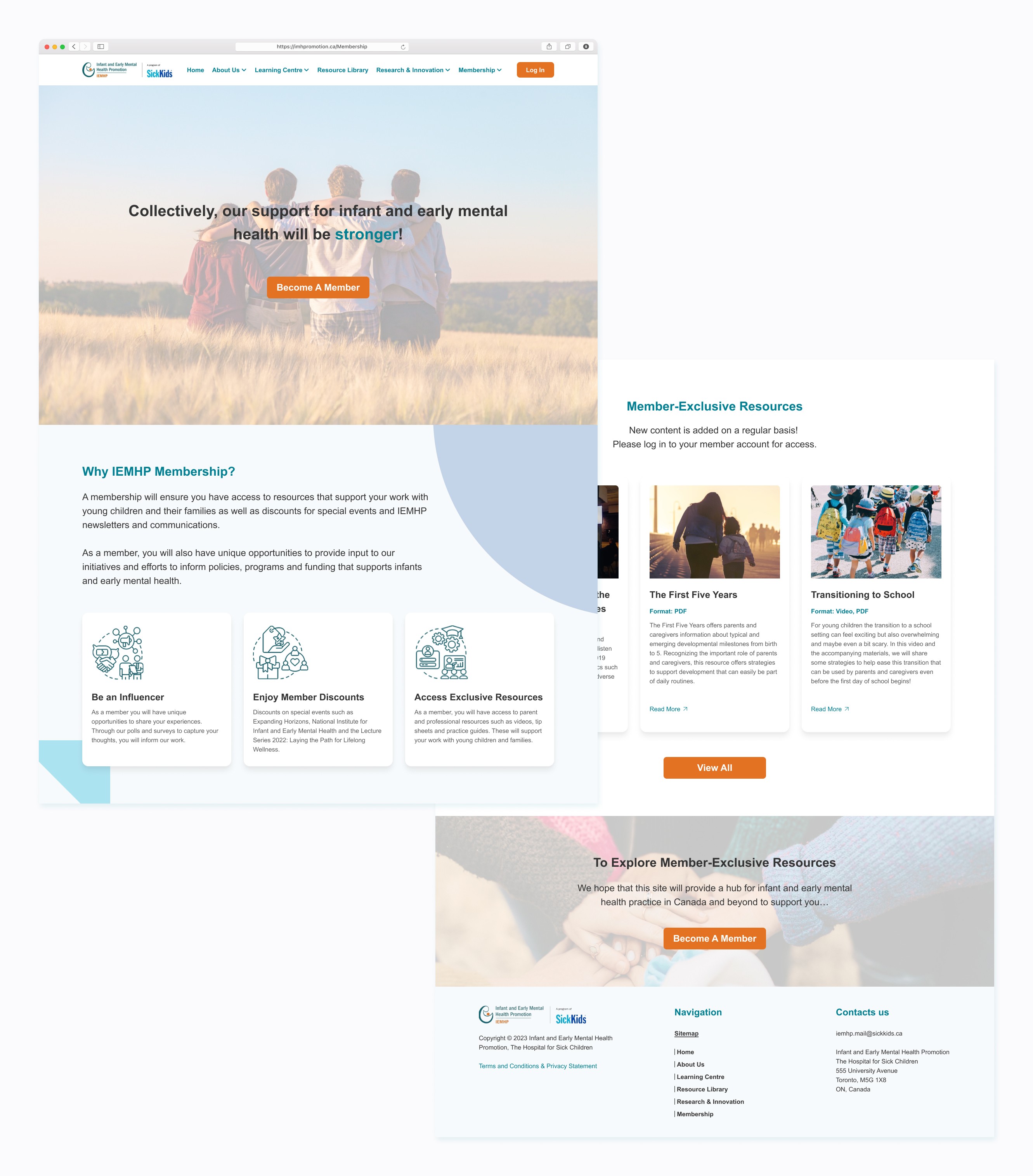
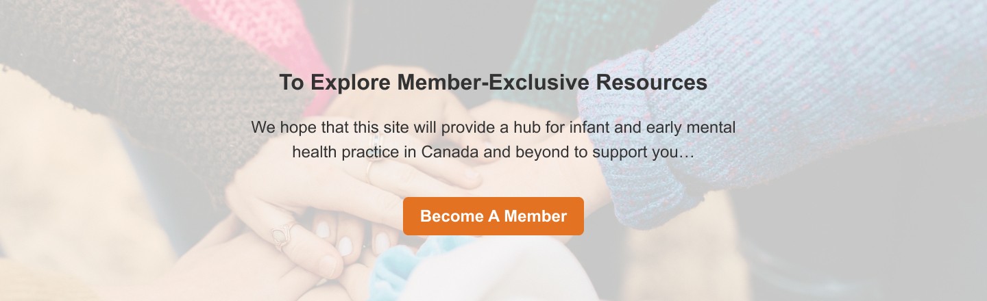
Call-to-action buttons: To encourage users to sign up for membership, I have incorporated prominent and visually appealing call-to-action buttons throughout the design. These buttons are strategically placed to guide users and draw their attention. Using clear and concise phrases such as "Become a Member," I aim to motivate users to take action and join the membership program. By making the call-to-action buttons visually appealing and using persuasive language, the design encourages users to engage and become members.
Highlight the benefits: In order to effectively communicate the benefits of becoming a member, I have created a dedicated section called "Why IEMHP Membership." This section aims to highlight the prominent advantages and value of joining the organization. It includes key points such as discounts on events, access to member-exclusive content, networking opportunities, and the ability to contribute to the organization's mission. By prominently showcasing these benefits, potential members can easily understand the advantages they would gain from becoming a member.
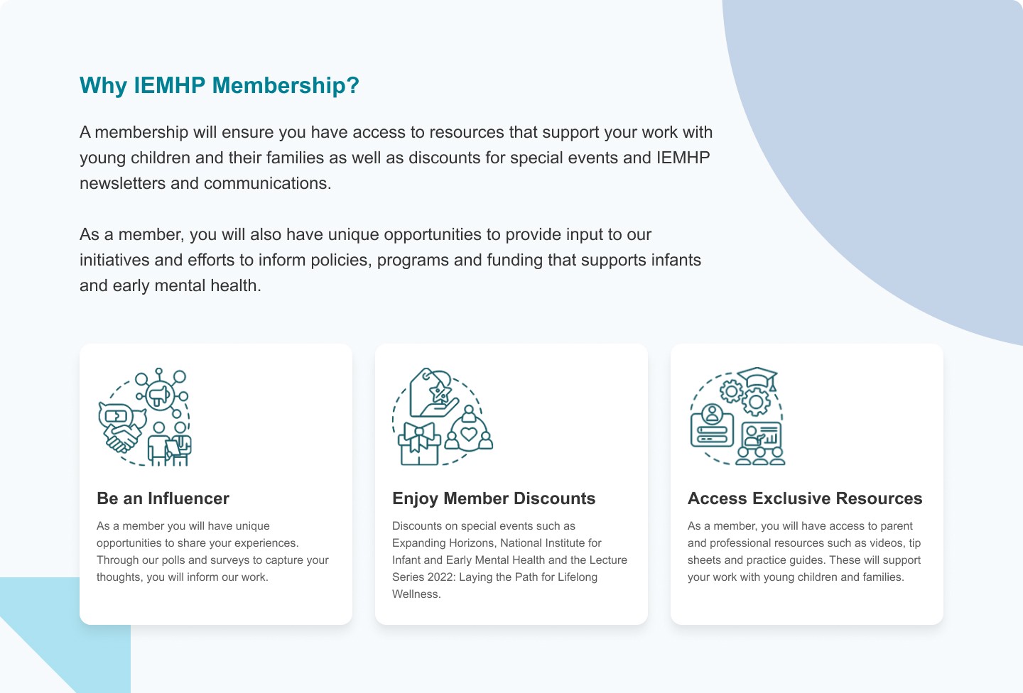
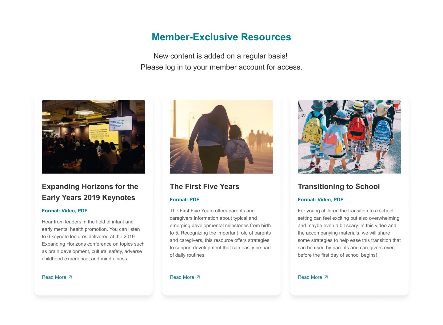
Concise preview of exclusive conten: Showcase a brief preview of the member-exclusive content to users. In each member-exclusive card, you will find an captivating image that showcases the content, along with a clear display of the resource format. Additionally, a concise summary is provided, highlighting the exclusive and valuable resources and information available only to members.
Optimize for tablet and mobile devices: Acknowledging the increasing use of smartphones and tablets for website access, I have prioritized the comprehensive responsiveness and optimization of the membership page to cater to these devices. By implementing responsive design principles, I have ensured that the page seamlessly adapts to various screen sizes, providing a user-friendly experience for smartphone and tablet users. This optimization ensures that users can easily navigate the membership page, access its content, and engage with its features, regardless of the device they choose to use.
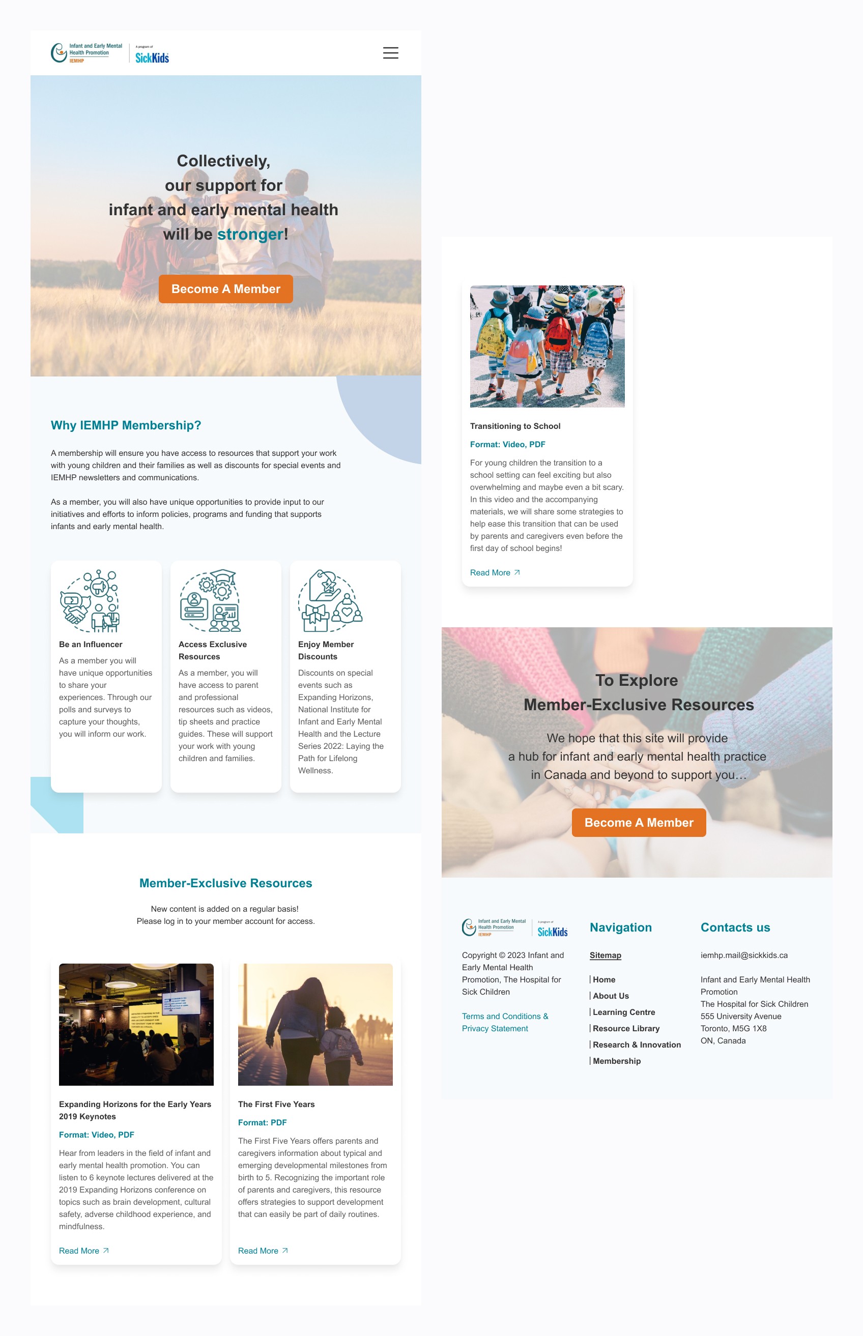
Mockup For Tablet
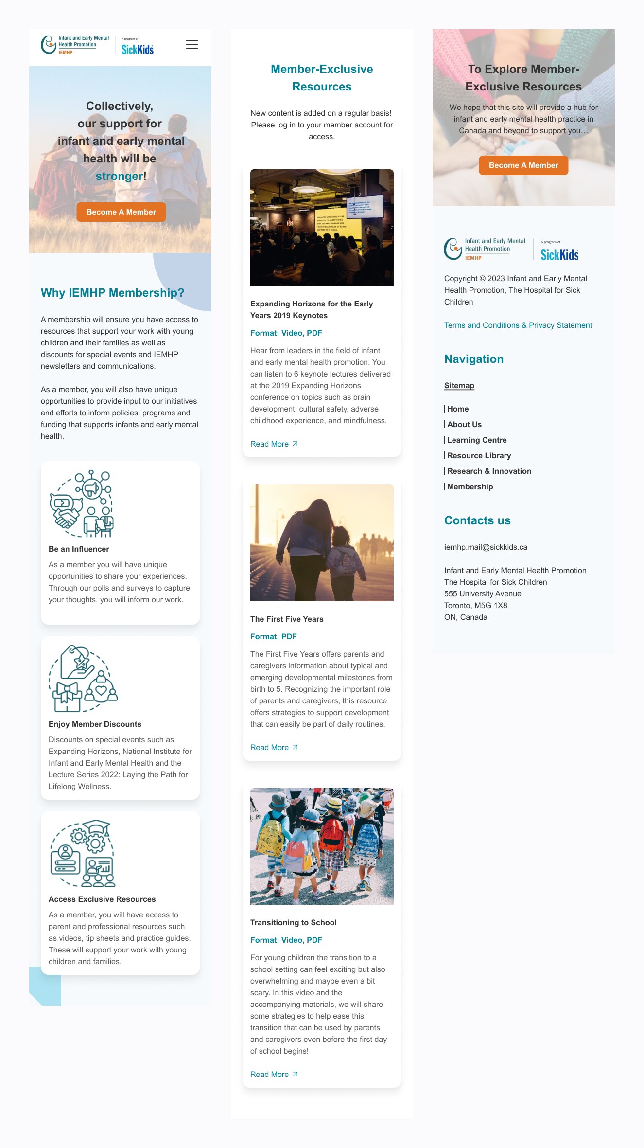
Mockup For Mobile